Monday, 2 April 2012

Evaluation part 2

Here you can see my film poster and other professional film posters that I researched and took inspiration from to decide on my final outcome. I decided to make the film title stand out and i used a completely different font to represent the show, the font was called ‘showbiz’ and I was drawn straight away to this as it fitted in with the genre and connotations of the film. The purple colour stands out against the dark backgrounds so draws in the audience more.
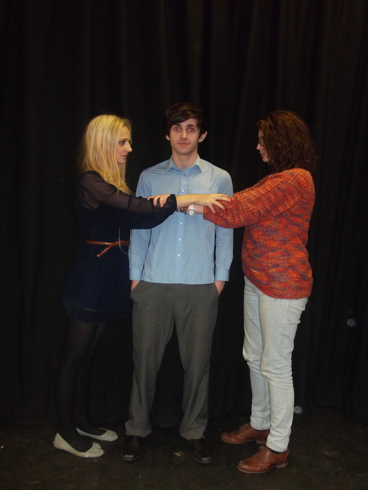
When taking the main image for the poster I wanted something that would straight away portray what the film is about and draw a certain audience to it, the whole main point of the trailer is about two girls fighting to get the main spot in the school show to star with the main boy. So this image had to show through their body language how they are fighting and pulling the boy to get in the spotlight. The iconography is clearly presented for example you can see the geeky girl (girl on the right) has more a quirky sense of style and definitely represents a school nerd for example the glasses, shoes, old jumper, curly hair and shirt collar all are denotations of how a geek is represented. The popular girl on the other hand has a more confident facial expression and with the blonde hair and her ‘pretty’ little dress you can see the big significance in style between the two. The main boy in the middle shows a confused face and literally ‘in the middle’ of a fight between the two girls.
Main conventions of a film poster is that there is some kind of release date that is noticeable so I made sure that I included the 'IN THEATRES JULY 2012'


The audience know what month it is out. I thought July during summer would be a perfect time to show the film because it’s more like a chick flick comedy that the younger female audience would find more interesting and this is the time when they would most likely watch it.        
This is my final magazine front cover:


Here are some magazine front covers that I looked at to give me some inspiration:
                                    

Evaluation

1. In what ways does your media product use, develop or challenge forms and conventions of real media products?
Both me and my partner decided to come up with a romantic comedy trailer as this is what we both took a high interest in and thought if we planned it correctly then it could work well, it was also the least popular genre that was chosen from peers in our class so we decided to be brave and go for that genre. Researching other romantic comedy trailers helped me a lot as I got to see the professional standard I was aiming to achieve like the camera angles, shots, mise en scene and sounds, all these conventions would apply me to create a professional trailer. Conventions of a trailer are that the plot is established throughout so it is appealing to the audience and they get a sense of what it is about which generally includes a beginning, middle and end. When creating our trailer we had to storyboard our ideas and show what direction we were going in and how we were going to get the message across. Me and my partner spent a few lessons trying to come up with a good plot and changing scenes sometimes to overall get a comical romantic comedy feel. When doing my ancillary tasks I created a film poster and a front cover of a film magazine.


                        Some Examples:


Monday, 12 March 2012

Planning for Film Posters

Here is my process sofar of my film poster.


This is my final piece for my film poster after testing with different images and texts I have finally come to a conclusion. 


I think my final outcome for my film poster as a whole looks good and I am happy with the progress. 


Colours- The whole poster mainly is dark as it follows the theme of a stage with the black curtains and floor acting as a signifier to a 'show' so I tried to lighten the poster up as it is meant to be a romantic comedy. I did this by adding flowing and feminine calligraphy fonts to regain the genre, just by doing this it lifted the poster up. The colour purple is a main colour in our trailer so by using this for the 'spotlight' and the actors names it definitely brightened up the poster and made it more attractive.


Main Image- I think the main image works well in this particular task because it literally explains what the film is about and backs up the trailer and the name of the film 'Under The Spotlight'. I think the image is very central and eye catching, also it shows the comical side to it and explains itself very well almost like it's telling a story without reading anything else.


Fonts- When deciding what fonts I wanted to represent the film I looked at many film posters and saw they had bland fonts with comedies so I wanted to do something different and make it look more feminine by using an italic Calligraphy font that made the words look very soft. I also included a very detailed font for the word 'Spotlight' which I think looks very conventional and sticks to the theme of the name of the movie.


Small Fonts at the bottom- This is a main signifier and convention of all film posters, they include names of the directors, producers, film company and others in very small writing which is usually hard to read but can just about see it. I included my own written names which I think adds versilimilitude to the viewer.


Tagline- The tagline 'fight to be in the Spotlight' again is backed up by the main image as it shown the two main girls fighting over the main boy to appear in the spotlight (the school show). This is very conventional of a film poster and gives the audience something to recognise it by fitting in with the narrative of the trailer. This tagline is very literal.


Website- The website at the bottom is just something to promote the film more and gives the audience something to consider if they want to know and read more about the upcoming movie.

For the title of the film I have tried to capture a font that will have some sort of significance to the genre and storyline of the trailer so I chose a font called 'showtime' on a website I found called FontSpace.com this was extremely helpful as it gave me many options of fonts I could have used.

Above is the process I went through to find the font and to change it's colouring to suit our main title of our film.


Photography for Ancillary Tasks

     My photography represents the romantic comedy genre so I met up with the actors in our trailer and we took some images based on the storyline that the trailer represented. Here are some examples of the photography that we took.


These are some examples of some images I took for the film poster/ magazine. It was hard to position the cast to represent what the film was about and get the genre across to the audience. By looking at other film posters I got an idea of what kind I pictures I had to take. 

I needed Millie and Miranda to look opposite for example, Millie had to represent a 'geek' so the costume was more smart than stylish whereas Miranda on the other hand wore a dress with a waist belt that looks very 'in' and in style, because Miranda has blond hair I think this signifies a 'popular' girl as it is usually more stereo typical of a popular girl to have lighter hair and it fits in with the 'American' well groomed look, this is more than Millie who has short brown and curly hair which is more stereo-typical of a geek. 

I positioned them in front of a black stage curtain which fits with the title of the film 'under the spotlight' and the idea of being on stage and the star of the show, so the black background was simple but effective and ties in with the film.